Navigation Redesign
How best practices were used to improve user experience
Long story short
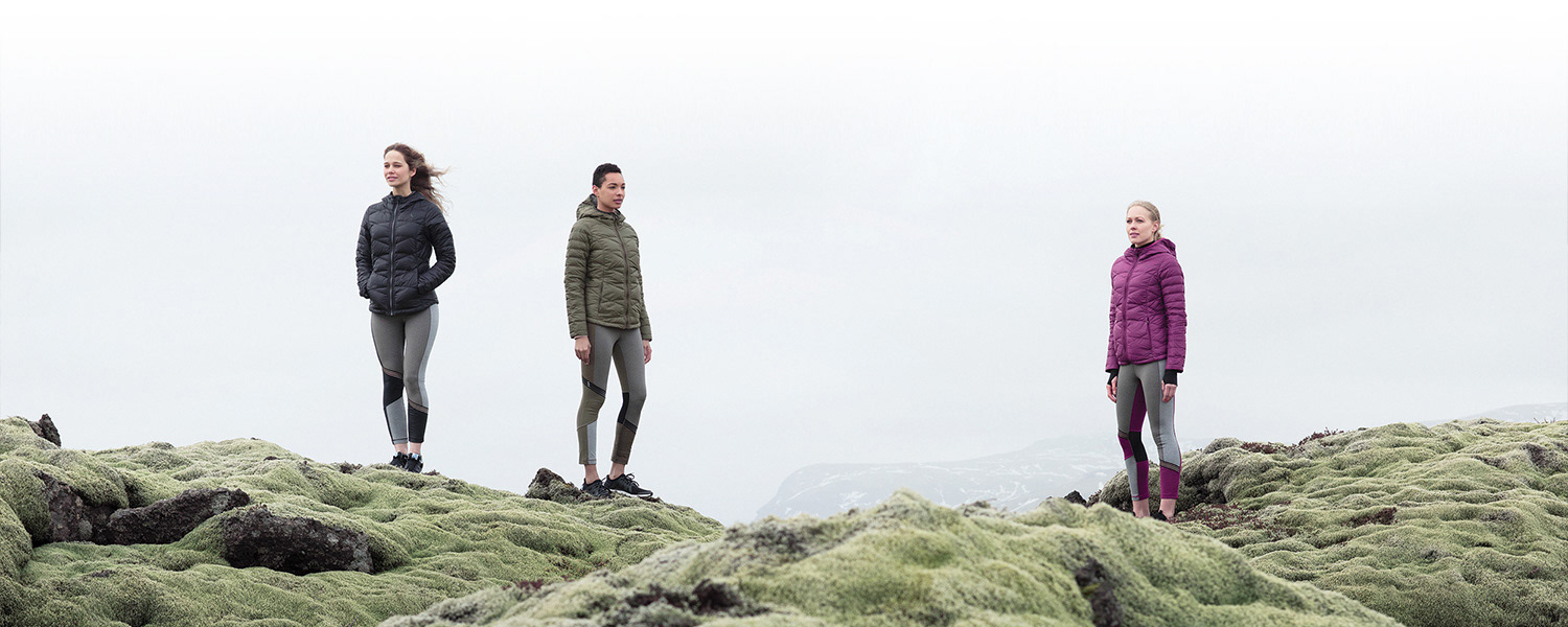
Lolë is an eco-conscious athletic apparel designer and retailer. Their mission is to make comfortable, sustainable clothing using ethical, earth friendly fabrics and recycled products, such as post-consumer plastic bottles, and recycled fishing nets.
When Lolë approached me to provide UX/UI Design support for the redesign of their e-commerce website, I jumped at the opportunity. While this project was rewarding professionally, it was also gratifying to help a business that is combatting what I think is one of our most important environmental concerns—plastic pollution.

The Challenge
Through UX research and testing, we discovered that users were finding the global navigation on Lolë's new website difficult to read and comprehend.
I was given the task of improving the user experience.
The Problem
The design of an e-commerce’s global navigation is critical to the site’s usability and success in driving visitors down key paths.
Studies have shown that 68% of users on e-commerce sites are likely to be browsing, while only 16% are actually making pointed purchases. Therefore, it's important that the navigation's design allow visitors to quickly and easily find the content they're seeking.
Assessing the global navigations design revealed a number of issues that were negatively impacting the user experience:
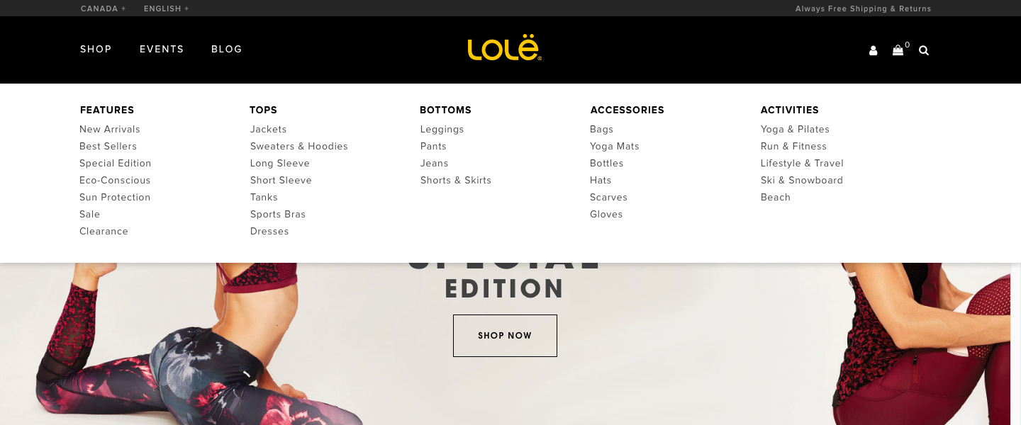
01: All-Caps Text
02: Font Size
03: Reversed Text
04: Hidden Product Categories
05: Missed Opportunity With The Mega-Menu
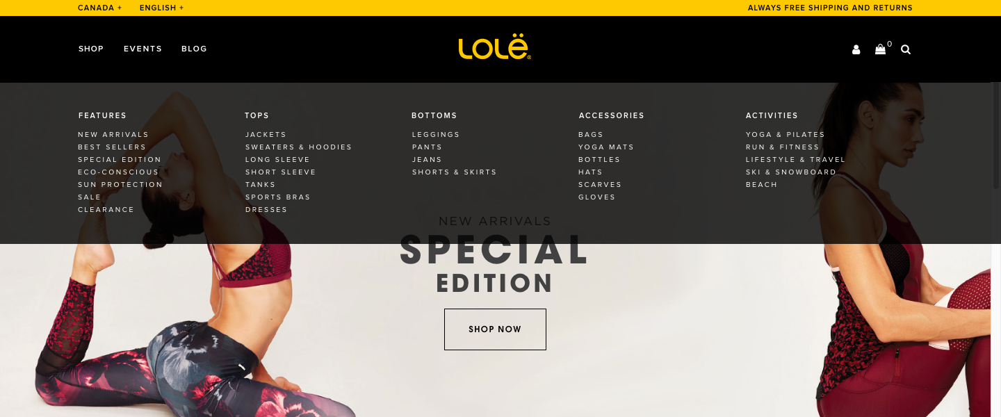
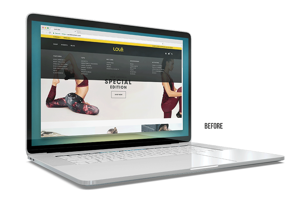
01: All-Caps Text
Above is the original design of the navigation.
As you can see, the design had the entire global navigation set in all-caps. Using all-caps is fine in contexts that don’t involve reading (such as acronyms or logos), but when all-caps is used in every instance of text it forces users to work harder. Users are not able to scan content and easily recognize word shapes. Instead, they struggle to recognize and process the boxy shapes of uppercase words, forcing them to read letter-by-letter, slowing reading speed and comprehension.
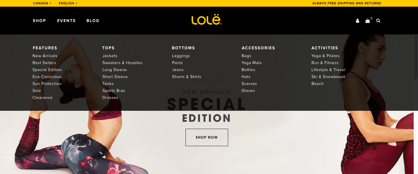
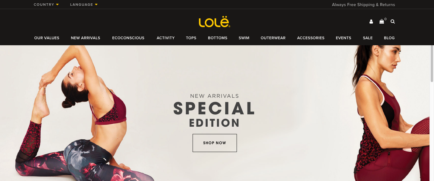
The Solution: Mixed-Case Text
The solution is to use mixed-case text. In the design below, some of the all-caps text has been updated with mixed-case. This simple change creates an instant improvement to the user experience, making the categories much easier to scan, read, and comprehend.

02: Font Size
As far back as 2005, users have overwhelmingly voted for ‘small text’ as the number one web usability problem. Many studies have shown that user patience for reading small text is almost nonexistent. Simply put, users are not going to stick around to read content they’re struggling to see.
For many years now, studies have been saying the best practice font size in web design is 16pt font. In order to create a good user experience, fonts should not be more than a point or two smaller than this point size. The design of the above original navigation used 10pt fonts!
The quality of a website’s typography can be the difference between users converting or becoming frustrated and leaving the site. Using ‘all-caps’ compounded by ‘small text’ in a critical navigational element, like the global navigation, is a costly mistake.
The Solution: Larger Fonts
In the design below, the font size has been increase to 14 pt allowing the user to comfortably read the text at a normal viewing distance.
03: Reversed Text
The original navigation was designed with white text on a dark background (reversed text). Studies haven shown that reversed text is twice as hard to read than dark text on a light background. This is because white text stresses the eye by stimulating all three of the eye’s color sensitive visual receptors in nearly equal amounts.

If the goal of UX is to provide a delightful user experience, design choices that discomfort the user are a bad idea.
The Solution: White Background, Dark Text
In the design below, the reversed text has been swapped out for dark text on a white background. The readability immediately improves, allowing the categories to become much easier to scan and comprehend.
Also, the top bar's yellow color has been changed to grey. Yellow is the color of highest visibility and was upsetting the visual hierarchy of the global navigation by causing too much visual focus to be put on a less important navigation element.
04: Hidden Product Categories
The original design pattern used a solitary navigation item called ‘SHOP’ that contains all the main product categories.
Many large-scale usability tests have determined the best practice is to display main product categories directly in the top level of the navigation. Not displaying them causes multiple and severe navigational issues for users. This is why 82% of e-commerce sites do not hide their product categories.
Collapsing the entire category list within a solitary navigation item makes it needlessly cumbersome for new users. They are unable to immediately understand the website or the products they carry. This particularly applies to external traffic that does not land on the homepage.
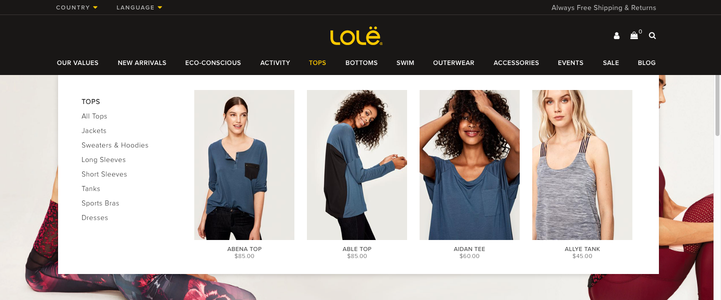
The Solution: Top Level Main Categories
In the design below, the main product categories have been moved to the top level of the navigation. Users can now quickly understand what type of site they’ve landed on, and quickly scan the type of products the site carries, letting them begin making decisions with fewer clicks.
05: Mega-Menu Missed Opportunity
Mega-menus are a great navigation solution for e-commerce sites which have a lot of content. However, having a mega-menu that does not display product imagery is a missed opportunity to create a better user experience.
Here are a few of the benefits of including product imagery in a mega-menu:
• Increased visual impact.
• Easier to understand what the site has to offer.
• Boost in conversion.
• Increase in the navigation's aesthetic appeal.
• A means for style-based navigation paths.
• Able to display products at the top level of the site.
• Means to visually promote key products and categories.
The Solution: Add Product Images
In the design below, product images have been added to the navigation, which greatly improves the user experience for all the reasons mentioned above.
And, The final version...
The Results
The design of a website’s navigation has a bigger impact on the site’s success or failure than almost any other design factor.
The end result of the redesign of Lolë's global navigation is a design that is a significant improvement over the original design. One that follows best practices while providing the user an improved experience navigating the site.